Walk into a room, and before you even take in the furniture, textures, or lighting, something invisible yet powerful greets you first — color. It whispers to your emotions before your mind even realizes it’s there. A cool shade of blue invites calm. A muted beige offers warmth. A dash of red ignites energy. Colors are not merely decorative choices; they are emotional notes that together compose the music of a space.
To combine interior colors harmoniously is not simply a matter of aesthetic taste — it’s an act of emotional engineering. You are shaping how people feel the moment they step into a room. And when done right, color becomes silent poetry: balanced, comforting, and alive.
This guide is not a checklist or a trend report. It’s a deep exploration into the philosophy, psychology, and artistry of color harmony — and how you can use it to craft a space that feels like home in the truest sense.
Part I. Understanding Color: The Emotional Foundation
Before diving into combinations, we must understand color itself — what it means, what it does, and how it interacts with our minds.
1. The Psychology of Color
Every color carries emotional weight. Here’s a simplified emotional spectrum:
-
White — purity, openness, simplicity. It expands a room but can feel sterile if overused.
-
Black — elegance, mystery, depth. It grounds and anchors, yet too much can absorb life from a space.
-
Gray — neutrality, balance, sophistication. The modern mediator, but risky if it drains warmth.
-
Blue — calm, clarity, trust. Ideal for bedrooms and bathrooms, where tranquility reigns.
-
Green — renewal, nature, balance. Soothes the eyes and stabilizes emotion.
-
Yellow — optimism, energy, light. A touch uplifts, but excess overwhelms.
-
Red — passion, power, warmth. Dynamic and lively, but it demands respect.
-
Brown — earth, comfort, security. Invites grounding and connection.
-
Pink — tenderness, sweetness, compassion. Perfect for softening modern edges.
-
Purple — creativity, luxury, introspection. A rare accent that evokes imagination.
Each tone’s impact depends on its saturation (intensity) and value (lightness/darkness). A dusty rose and a neon pink are both “pink,” yet they tell completely different stories.
2. The Science Behind Harmony
Color harmony isn’t about matching; it’s about balance. On the color wheel, complementary colors (opposites like blue and orange) intensify one another, while analogous colors (neighbors like green and yellow) soothe and blend.
A harmonious palette creates equilibrium — between warmth and coolness, brightness and depth, contrast and unity. The goal is not perfection, but coherence, the sense that every color belongs.
Part II. Foundations of a Harmonious Color Palette
1. Start with Emotion, Not Trend
Ask yourself: What do I want to feel in this space?
Not what’s fashionable — but what’s personal.
-
Do you want serenity? Choose cool tones like soft blues, greens, and muted neutrals.
-
Do you crave vibrancy and creativity? Embrace contrast: deep navy with saffron, olive with coral.
-
Do you want warmth and nostalgia? Lean toward earth tones — ochres, terracottas, creams, browns.
Harmony comes from alignment between your inner world and your visual environment. The colors you live with should reflect who you are, not who Pinterest tells you to be.
2. The 60-30-10 Rule: The Golden Ratio of Balance
This timeless formula creates proportion and harmony effortlessly:
-
60% — Dominant color (walls, large furniture)
-
30% — Secondary color (upholstery, rugs, curtains)
-
10% — Accent color (art, cushions, decorative items)
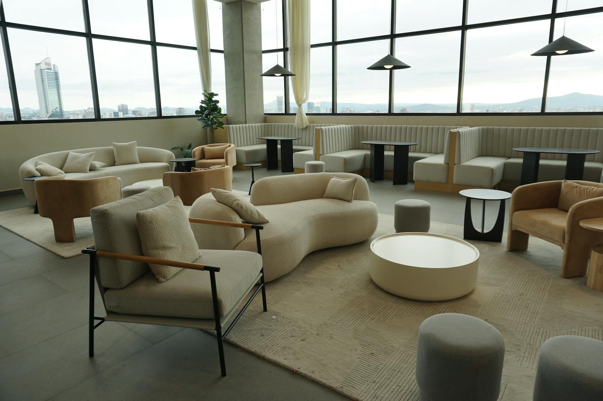
Example: A soft ivory room (60%), with sage green textiles (30%), and brass or ochre accents (10%). The result? Warmth, freshness, and quiet elegance.
This principle ensures that no single color overwhelms. It’s the rhythm that keeps your visual symphony in tune.
3. The Power of Neutrals
Neutrals are not “boring.” They are the silence between notes — the space that gives color room to breathe. Whites, beiges, grays, and taupes form the base upon which vibrant tones can shine.
For instance:
-
Pairing warm neutrals (cream, sand, camel) with olive or rust feels organic and cozy.
-
Cool neutrals (gray, charcoal, stone) enhance blues, teals, or even blush tones for a refined, modern mood.
A neutral base allows you to adjust accents easily as seasons — or moods — change.
Part III. Techniques for Combining Colors Harmoniously
1. Tonal Harmony: Variations of the Same Hue
One of the safest and most elegant approaches is to use varying tones of a single color. A room in shades of green — from sage to moss to emerald — creates depth while maintaining calm. This method is particularly effective in minimalist or Scandinavian-inspired designs, where subtlety reigns.
The trick is to vary texture: matte, glossy, woven, and natural finishes prevent monotony and keep the tone-on-tone look alive.
2. Complementary Contrast: Balance of Opposites
Complementary colors (like blue and orange, red and green, yellow and violet) create visual energy. But the key is moderation. Choose one as the dominant tone and use its opposite as an accent.
For example:
-
A navy living room with burnt orange pillows — bold yet tasteful.
-
Olive walls with soft blush decor — earthy and romantic.
Too much contrast feels chaotic; too little feels dull. Harmony lies in the tension between these extremes.
3. Nature as Palette: Organic Inspiration
Nature never gets color wrong. A forest offers a perfect palette: deep greens, earthy browns, muted grays, a hint of sunlight gold. A coastal scene blends blues, sands, whites, and driftwood beige effortlessly.
Use these natural models. They embody harmony because they evolved through balance — just like a well-designed home should.
4. Layering Warm and Cool Tones
Many fear mixing warm and cool tones, but when done carefully, it brings complexity and life. For instance:
-
Pair cool gray walls with warm caramel leather furniture.
-
Combine a dusty rose sofa with cool sage walls.
-
Add brass fixtures to a navy kitchen — the metallic warmth offsets the cool depth.
This interplay feels human — because we, too, are contradictions: calm yet passionate, grounded yet restless. The most beautiful interiors mirror this emotional balance.
Part IV. Advanced Insights: Beyond Color, Into Feeling
1. Texture and Light — The Silent Partners of Color
A color doesn’t exist alone; it changes with light and texture. A beige wall under morning sunlight feels golden and alive, yet under cold LED light, it turns flat and pale.
Always test paint samples in different lighting throughout the day. Observe how shadows and surfaces interact. Matte walls absorb light for softness; glossy finishes reflect it for vibrancy. Linen curtains filter light into warmth; sheer whites make it glow.
Color harmony is not static — it breathes, shifts, and evolves with time and daylight.
2. Personal Symbolism and Memory
Color is emotional memory made visible. Maybe the soft blue of your childhood curtains calms you, or the terracotta of an old family home feels comforting. Using these personal tones weaves your story into your space — authenticity that no designer can replicate.
A truly harmonious home doesn’t just look right; it feels like you.
3. Cultural Nuance
Colors carry different meanings across cultures. Red signifies luck in China but warning in Western contexts. White represents mourning in some regions and purity in others. When designing a home that honors heritage or multicultural sensibility, be mindful of these associations. True harmony also means cultural respect.
Part V. Practical Application: Real-World Examples
1. The Serene Sanctuary (Bedroom)
Goal: calm, rest, emotional balance.
Palette: muted blue-gray walls (60%), warm white bedding (30%), and soft wood tones with linen beige accents (10%).
Effect: a cocoon of tranquility that slows the mind after a long day.
2. The Vibrant Living Space (Living Room)
Goal: energy, connection, joy.
Palette: ivory walls (60%), forest green sofa and oak furniture (30%), mustard and coral accents (10%).
Effect: uplifting yet grounded — a space that invites conversation and laughter.
3. The Elegant Workspace (Office)
Goal: focus, clarity, creativity.
Palette: warm gray walls (60%), walnut desk and black metal details (30%), and touches of teal or olive (10%).
Effect: intellectual yet inspiring — a place where productivity feels natural, not forced.
Part VI. The Philosophy of Harmony
Harmony is not achieved by following formulas, but by listening. Listen to your instincts. Listen to how a color makes you feel. Interior design is not decoration — it’s emotional architecture.
A harmonious home doesn’t shout; it hums quietly in tune with your soul. It’s where every shade tells a story of balance — between chaos and order, energy and stillness, the world outside and the world within.
Conclusion: The Art of Living in Color
To combine colors harmoniously is to understand that beauty lives in balance, not perfection. It’s the soft gray that lets gold shine, the quiet wall that makes the painting sing. It’s the invisible rhythm that turns a house into a sanctuary.
When you stand in your finished space and feel peace — not excitement, not awe, but peace — that’s when you’ve found harmony. It means your colors are no longer competing for attention. They’re conversing, like old friends who understand each other without words.
In the end, color harmony is less about what you see and more about what you feel.
And that feeling — calm, whole, complete — is what turns four walls into home.


